The Inland Northwest has had a rollercoaster winter so far, which isn't really that unusual. Let's first take a look at where we've been.
November had temperatures that were pretty close to normal for much of the month, but we did have a short warm spell in the middle of the month. (The dark blue bars are the daily high and low temperature. The red shading shows temperatures that were warmer than normal, while light blue shading is for temperatures colder than normal.) Then temperatures warmed as November turned to December. Remember that record warm day of December 1st? It hit 59F in Spokane, 64F in Lewiston, and 70F in Wenatchee! Many locations were still waiting for their first snow of the season.
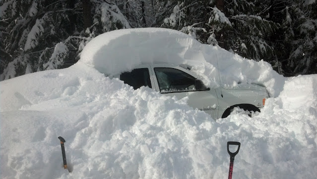
By mid-December, temperatures had settled back into more typical readings for that time of year. Then right after Christmas, we took a plunge into the teens and single digits for about 10 days, with a fair amount of snowfall for most everyone. Winter had definitely arrived. The Wenatchee area received record snowfall on January 6th.
But temperatures rebounded back into the 30s by the second week of January. What's more is that the snow stopped. The Inland Northwest had lapsed into a stagnant, foggy pattern.
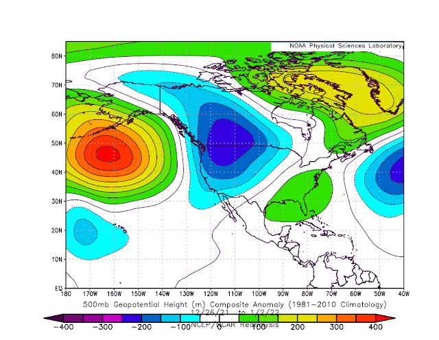
So what did this look like on the weather maps? To answer this, we'll show you the pressure anomaly charts at 18,000 ft elevation. Green, yellow and orange colors will indicate that the air pressure is higher than normal, which implies warmer-than-normal temperatures and drier weather. Blue colors will indicate that the air pressure is lower than normal, indicative of colder-than-normal temperatures and stormy weather.
Here's the weather map for late November and early December. Notice the large area of green and yellow colors over the western US. This corresponded to dry and mild weather for the West. Meanwhile, cool colors over the northeast US relate to cooler, wetter weather there.
For most of December, the pattern changed (see figure below). Now the colder and stormy weather was largely up in Canada, with the vast majority of the lower 48 enjoying drier and milder weather. The Pacific Northwest was on the cool, stormy side of things. Notice the strong high pressure anomaly out near the Aleutian Islands (left side of the map). This pattern is very typical for a La Nina winter, which is what we are currently in. This forces Pacific storms to either go up over Alaska and into Canada, or storms can take a southern track near Hawaii and into the West Coast.
The 10 days after Christmas were much colder and snowier. The weather maps for this period agree with this. The strong high pressure is still out near the Aleutian Islands. But the cold lower pressure is now much stronger over the western US and Canada. Meanwhile, the weather was warmer and drier over the eastern US. It's very common for one side of the US to be stormy while the other side is drier.
But the pattern changed in the 2nd week of January (image below). In fact, the pattern completely flipped. Now high pressure dominates the western US, while cold low pressure prevails over the eastern US, especially the southeastern states. Notice that the strong high pressure near the Aleutians has completely disappeared.
So that shows how our weather pattern flipped from mild, to cold and stormy, and then back to mild and dry again. What should we expect going forward from here? The computer forecast models have been indicating another pattern change should take place around the end of January.
When we're looking far into the future, it's more helpful to look at a number of computer forecasts rather than just one. The US National Weather Service has 30 computer forecasts (labeled "G" in the following charts). The Canadians have 20 forecasts (label "C") and the European Weather Center has 50 forecasts (label "E"). If we average all 100 of these forecasts for the last 3 days of January, we get the following graph. The color scheme is similar to what we've already been looking at. The "warm" colors in the Pacific show that the Aleutian Island high pressure is forecast to redevelop by the end of the month. But instead of "cool" colors over the Northwest, we see they are over the Southeast. We haven't seen this pattern yet this winter.
But we can do more than just average the 100 forecasts. We can run a statistical program that will group them into 4 different clusters, or potential scenarios.
Cluster 1 (upper left in the figure below) shows a very strong area of high pressure near the Aleutians, with cooler, stormier weather over the Pacific Northwest. 29 of the 100 models fell into this cluster. But 38% of the European models agree with this cluster, and the European models tend to verify better. If you like winter weather, this is the pattern for you.
Cluster 2 (upper right) is similar to Cluster 1, but the Aleutian high isn't as strong, and the cold/stormy weather is more in Canada and not so much in the Pacific Northwest. Like Cluster 1, 38% of the European models agree with this idea.
Cluster 3 (lower left) is much different, with "warmer" high pressure colors extending into the western US. 50% of the Canadian models favor this cluster, while only 8% of the European models agree with this. If dry and mild is your preferred weather, then you are hoping for this weather pattern.
Lastly, Cluster 4 has a very strong area of high pressure over all of Alaska, and cold stormy weather over the eastern US. 30% of the US models (label "G") agree with this idea, but only 16% of the European models.
So what does all this mean for our chances of precipitation? Here's the computer forecasts of precipitation for those 4 different cluster scenarios.
Note that Clusters 1 and 2 are wetter in the Pacific Northwest, while Clusters 3 and 4 are very dry for the Northwest. If you do the math, it's a 58% chance of being wet during this period, and a 42% chance of being dry.


